New Wordpress Theme for Indigoprime
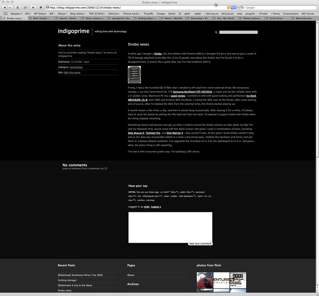
I’ve been happy with the Hemingway-based Ninja-Monkeys theme, and I still use it over at my professional blog. Here’s what it looked like:
As you can see, it’s a little bland, but perfect for text-heavy sites. Also, on the front/index page, there were problems with embedded elements and graphics spilling-over into the next column - it looked ugly.
Lately, I’ve been wanting to add more, larger photos in-line in blog posts and I’m embedding more video.
So I hunted around for a new theme. I liked the prophoto themes, but thought they were expensive. Graphpaper Press has some wonderful themes, and in fact I may use one of theme over at my (now offline) travel blog - exerro.com, but they are also a paid-for commercial product (they are however, exactly what I’m looking for when we travel).
I was happy when I found Derek Punsalan’s site over at 5thirtyone.com. He has a couple of free themes, including the highly visual unstandard theme, and the one I settled on, grid-focus.
Grid-focus enables me to have large graphics and embeds in the post, up to 700px across (I edited the .css file to get more width here at the expense of deleting the third column). This shows off graphics well and eliminates the the problem of overlap between posts.
I think it looks great, don’t you?
